Как создать гамбургер меню, используя только CSS и HTML
�� Привет! Сегодня мы создадим анимированное гамбургер меню только на CSS и HTML, используя не очевидный для многих новичков способ — чекбоксы.
Начнём!
Подготовим шаблон. В качестве кнопки для открытия / закрытия меню будем использовать тег с свойством for . Таким образом, при клике на лейбл, будет срабатывать чекбокс.
Выглядит это пока достаточно грустно:
Добавим немного стиля для кнопки:
/* скрываем чекбокс */
#menu__toggle opacity: 0;
>/* стилизуем кнопку */
.menu__btn display: flex; /* используем flex для центрирования содержимого */
align-items: center; /* центрируем содержимое кнопки */
position: fixed;
top: 20px;
left: 20px; width: 26px;
height: 26px; cursor: pointer;
z-index: 1;
>/* добавляем "гамбургер" */
.menu__btn > span,
.menu__btn > span::before,
.menu__btn > span::after display: block;
position: absolute; width: 100%;
height: 2px; background-color: #616161;
>
.menu__btn > span::before content: '';
top: -8px;
>
.menu__btn > span::after content: '';
top: 8px;
>
Теперь стилизуем само меню. По-умолчанию оно будет скрыто — visibility: hidden , а открываться будет при установки галки на чекбокс.
/* контейнер меню */
.menu__box display: block;
position: fixed;
visibility: hidden;
top: 0;
left: -100%; width: 300px;
height: 100%; margin: 0;
padding: 80px 0; list-style: none;
text-align: center; background-color: #ECEFF1;
box-shadow: 1px 0px 6px rgba(0, 0, 0, .2);
>/* элементы меню */
.menu__item display: block;
padding: 12px 24px; color: #333; font-family: 'Roboto', sans-serif;
font-size: 20px;
font-weight: 600; text-decoration: none;
>
.menu__item:hover background-color: #CFD8DC;
>
Возможно, вам покажется непонятной строка .menu__btn > span , а именно комбинатор > .
Этот комбинатор находит прямых потомков элементов отобранных первым селектором.
Подробнее о нём можно прочитать здесь — https://developer.mozilla.org/ru/docs/Web/CSS/Child_selectors
Открыть / закрыть меню
Отлично, со стилизацией закончили, однако меню у нас до сих пор не работает. Самое время перейти к главной теме этого туториала — как реализовать открытие / закрытие меню только на CSS, используя чекбокс?
#menu__toggle:checked ~ .menu__btn > span transform: rotate(45deg);
>
#menu__toggle:checked ~ .menu__btn > span::before top: 0;
transform: rotate(0);
>
#menu__toggle:checked ~ .menu__btn > span::after top: 0;
transform: rotate(90deg);
>
#menu__toggle:checked ~ .menu__box visibility: visible;
left: 0;
>
По порядку, начиная с самого простого:
- Свойство transform: rotate(45deg) — поворачивает элемент на 45 градусов. Поворачивая элементы кнопки меню под разным углом, мы получаем значок “крестик”, вместо горизонтальных линий.
- Псевдокласс :checked — находит только выбранные или включенные элементы. В нашем случае при активации чекбокса он становится :сhecked . Подробнее по ссылке — https://developer.mozilla.org/ru/docs/Web/CSS/:checked
- Комбинатор ~ — находит элементы, указанные справа, которые следуют за элементом, указанным слева и имеют с ним общего родителя. Подробнее — https://developer.mozilla.org/ru/docs/Web/CSS/General_sibling_selectors
Вот что у нас получается:
Добавим немного анимации
Для этого просто добавим свойство transition-duration: .25s следующим классам:
.menu__btn > span,
.menu__btn > span::before,
.menu__btn > span::after transition-duration: .25s;
>.menu__box transition-duration: .25s;
>.menu__item transition-duration: .25s;
>
Бургер меню на html и css
Для создания появляющегося гамбургер меню нам понадобится такая html структура:
Подробнее посмотреть как сделать бургер кнопку можно в нашей статье – Бургер кнопка для меню. Если вкратце, то мы стилизуем label как кнопку с помощью псевдоэлементов, связываем ее с чекбоксом атрибутом for и скрываем данный инпут. Теперь при клике на label у нас будет срабатывать чекбокс. Далее при помощи псевдокласса :checked и комбинатора + меняем стили кнопке для анимирования ее в крестик при клике.
Следующим этапом спозиционируем menu-list абсолютно, прижмем его к краю и с помощью transform:translateX(-100%) спрячем за экран. Далее воспользуемся для чекбокса псевдоклассом :checked и комбинатором ~ и вернем transform у menu-list в начальное состояние. Остается немного стилизовать и наше меню готово.
How to make a burger menu – complete code and detailed explanation

This is quite a popular request – how to make a hamburger menu. I will show you a variant using HTML, CSS and JS. This is an adaptive variant, which means it will work on mobile devices as well.
Let’s start by creating the HTML markup. Let’s write the Header and add our burger “icon” inside (it’s just three span elements):
Now let’s add our menu, which will appear when the user clicks on the hamburger:
Now let’s add styles for the Header and for the button:
header < display: flex; justify-content: flex-end; >.menu-btn < width: 30px; height: 30px; position: relative; z-index:2; overflow: hidden; >.menu-btn span < width: 30px; height: 2px; position: absolute; top: 50%; left: 50%; transform: translate(-50%, -50%); background-color: #222222; transition: all 0.5s; >.menu-btn span:nth-of-type(2) < top: calc(50% - 5px); >.menu-btn span:nth-of-type(3)
Right now it looks like this:
The menu doesn’t look good. Let’s fix that by adding some styles:
/* Menu that will appear */ .menu < position: fixed; top: 0; left: 0; width: 100%; height: 100%; padding: 15px; background: #FFEFBA; transform: translateX(-100%); transition: transform 0.5s; >.menu.active < transform: translateX(0); >.menu li
This is the logic: Now we’ve hidden the menu off the screen with the transform property and the value translateX(-100%);
But when you click on the burger icon, we will add class .active to the menu – and it will return the menu to the visible area of the screen using transform: translateX(0);
Now we need to add this class to the menu (.menu) by clicking on the burger (.menu-btn) in JS :
let menuBtn = document.querySelector('.menu-btn'); let menu = document.querySelector('.menu'); menuBtn.addEventListener('click', function()< menu.classList.toggle('active'); >)We use toggle – to remove the class on click, if the item has one. So when we click on a hamburger, the menu appears and disappears.
If you want the menu to appear on the right, change the following property of the menu class:
transform: translateX(100%);
In fact, we have the burger menu ready. And now we need our “icon” turns into an X when you click on the hamburger.
We will use the same trick of adding a class for this. First, we’ll add the CSS:
/* Changing the burger icon when the menu is open */ .menu-btn.active span:nth-of-type(1) < display: none; >.menu-btn.active span:nth-of-type(2) < top: 50%; transform: translate(-50%, 0%) rotate(45deg); >.menu-btn.active span:nth-of-type(3)
And now in the JS code let’s make a switch, as we did earlier for the menu. Now we’ll do it for the “icon”. It goes like this:
let menuBtn = document.querySelector('.menu-btn'); let menu = document.querySelector('.menu'); menuBtn.addEventListener('click', function()< menuBtn.classList.toggle('active'); menu.classList.toggle('active'); >)Now you understand the principle which can help you to make a burger menu. There are many variants of implementation, send your solutions in the comments.
I’m attaching a video from our YouTube channel, you can watch it all in video format:
10+ Hamburger Menu Examples [CSS Only]
On today’s menu are CSS hamburgers. A responsive way to display an off-canvas menu using only HTML and CSS.
Every website needs to be responsive if it wants to be successful. Having a mobile-supported menu is vital to appeal to all audiences and devices. This is something which we will learn about in this article with how CSS responsive hamburger menus can help.
What Is A Hamburger Menu?
A Hamburger Menu is a way to display navigation links on a website, usually for mobile devices and smaller screens. However, CSS hamburger menus can be used for desktop websites as well. Once you click the “hamburger” icon, a sliding menu will appear, displaying on top of the main content.
They are also used when you have too many buttons and links on your header navigation bar. A responsive hamburger menu allows you to shrink all this into a more scalable menu design, creating a compact menu. Ideal for sticky navbars and one-page websites.
As you might have guessed, it is called a hamburger menu because the icon looks like a stacked burger ��
Different Types Of CSS Hamburger Menu Icons
We know where the hamburger menu gets its name from, but not all menu icons have to be the same. There are lots of different designs and icon animations to choose from, some of which you will see in our examples.
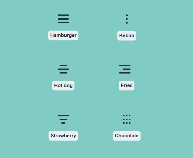
Consider the different icons above, not all will work for every website design, but as you can see, these menu icons can be quite creative. The same goes for their animations.
10 Amazing Hamburger Menu CSS Designs
Now that we understand what a CSS hamburger menu is and its main purpose, let’s go through some examples, and you can use yourself and get inspiration from them.
If you are looking to create a responsive design, mobile or just to fit more content in your navigation elements, a CSS responsive hamburger menu is one of the best solutions to go with.
1 Responsive CSS Hamburger Menu – CSS only
It’s quite common to have burger menus to replace standard horizontal menus on small viewports. This way, the menu becomes completely responsive and provides the best experience depending on the viewport size.
If that’s what you are looking for, this example will do exactly that, and with only CSS. To test it out, open the codepen in a new window and resize the result panel.
In responsive mode, the hamburger menu will open the list of items one after the other in a vertical column coming from the top. Quite a standard behavior for mobile devices.
2. Simple Centred Hamburger Menu
This one is very simple but effective; it only uses HTML and CSS to pull off a hamburger menu with some cool animations.
The hamburger icon itself, when clicked, transforms into a cross and works as the close button. The menu slides into view and displays in the centre with its navigation links.
If you like sliding menu designs and cool animations with many options, you may be interested in fullPage.js – A library that allows you to build full-width, full-screen web pages that are scrollable. It is even available for WordPress with Elementor and Gutenberg plugins and a WordPress theme.
3. Left Sliding Responsive Hamburger Menu
If you are looking for a more complete example of how a CSS hamburger menu can be useful, this CodePen renders an example website to showcase the use of the CSS hamburger menu.
It only uses pure HTML and CSS, so it is easy to learn from and understand what is happening. The menu icon is animated and transforms into a cross when the menu is open.
The menu itself slides out from the slide and overlays the main website. As this design is responsive, it will automatically hide the header menu and make the burger menu available once the screen width decreases.
If you are also interested in menus and not only on the hamburger elemenet, check out these examples of great side menus for your webpage!
4. Full-screen Hamburger Menu
Considering opening the menu element in full-screen? Then you’ll love this example. A CSS-only solution to display a burger menu and open it on a full-screen layer.
This kind of full-screen menu can come in handy when our menu has many items, sub-menus, or extra information.
5. Hamburger menu animations
If you are looking for different animations for your hamburger menu icon, you have to take a look at these ones.
It uses a single line of JavaScript (or jQuery) to set the state of the burger. The rest is all pure CSS.
6. Snappy Sliding Hamburger Menu
A very snappy and slick CSS hamburger menu that only uses HTML and CSS to pull this off.
The menu itself quickly slides out from the left and does not take up the whole screen, just the left side. The menu items have a nice hover effect as well. And if this effect is not fancy enough for you, you can create a better hover effect by getting inspiration from these CSS Button hover effects.
Good to work from if you are looking to add this to an existing website or you only want the basic structure.
7. Top Left Animated Hamburger Menu
Most CSS hamburger menus either slide out from the left and right or take up the whole screen. But this one is a bit different because it only uses the top left corner inside a bubble-shaped menu.
Very unique compared to the traditional hamburger menu design, this example could easily be changed to edit the colours or add an effective shadow on the background.
This one does use JavaScript, but it is only very minimal: basically just to toggle the CSS classes to change the menu status, open or closed. Nothing complicated. No libraries or dependencies to rely on, just pure JavaScript that is very basic.
8. Simple Left-Sliding Hamburger Menu Overlay
The animation is smooth and doesn’t feel tacky. The menu slides out from the left and sits on top of any main content behind it.
Doesn’t require any JavaScript, just works purely based on HTML and CSS, easy to work from or adapt to your liking.
The menu itself will be easy to edit and add your own content, simply write your own HTML elements inside, and the menu will slide out.
The hamburger menu icon also has a smooth open and close animation that only uses CSS.
9. Animated Full Screen Hamburger Menu
Featuring a floating CSS hamburger menu icon inside a circular background, once clicked, the menu uses a curricular opening animation.
The animation is very smooth and opens from the point of the menu icon itself.
Taking up the full screen would be great for busy navigation menus that require a lot of space with images, icons, and text.
Only uses pure HTML and CSS to pull this off.
10. Full Screen Morphing Hamburger Menu
A fun animated CSS hamburger menu that morphs outwards from the top right corner of the screen into a full-screen menu.
Only using HTML and CSS, the structure is simple to follow and make edits to add your own content and navigation links/style.
11. Multi-Depth Hamburger Menu
Sliding out from the left side of the screen, this menu design is more suited for complex navigation.
It has a lovely sliding animation, but the menu itself uses a very well-structured item list that can go multiple depths, useful for inner categories.
It uses HTML and CSS, which are generated from SCSS.
What Are the Pros and Cons of Hamburger Menu Designs?
These are the pros and cons of using the Hamburger Menu for your website:
Pros:

- Reduces Visual Clutter. The Hamburger Menu condenses your website’s navigation options. This frees up space and keeps your interface clean, thus preventing your site from overwhelming its users with too many options at once.
- Improves Website Appearance. Displaying multiple options simultaneously on one screen isn’t only impractical but also ruins your website’s appearance. With the Hamburger Menu, you can organize and present these options in a manageable way.
- Keeps Visitors’ Focus on Content. Fewer options mean less distraction for website visitors. This allows them to focus on the content of the page, which can improve engagement.
- Familiarity. Since people are already familiar with the Hamburger Menu, they already know what it means once they see it on your website. This will prevent them from getting lost and confused as they navigate your site’s menus.
Cons:
- Reduced Discoverability. Less tech-savvy individuals may be unfamiliar with the Hamburger Menu, preventing them from immediately seeing your website’s menus.
- Hidden Options. The Hamburger Menu hides your website’s menu. As a result, users might not realize the full range of options they can access.
- Extra Interaction Requirement. Users need to click on the Hamburger Menu’s icon to reveal your website’s actual menus. This addss an extra step to their navigation process, thus resulting in a slightly slower user experience.
Takeaway
We’ve seen a lot of different designs for CSS hamburger menus, some traditional, some a little different. Hopefully, you have found something you like from our examples and found inspiration to use one on your next website.
Find the perfect combination for your hamburger menu by using one of these amazing JavaScript menus.
The CSS hamburger menu has a wide range of uses: from responsive design, interactive experiences with floating menu icons, and providing you with more space with an off-canvas menu.
Overall, CSS responsive hamburger menus are a great way to make your website layout responsive and scale down to smaller screens on mobile devices. It is an easy way to make your header navigation section responsive and adaptable to different screen sizes.
Related articles
More articles which you may find interesting.
- How to Create a SlideBar Bullet-Navigation
- Cool CSS Animations For Your Website
- HTML & CSS Timelines Examples
- Beautiful Website Footer Examples
- Gorgeous CSS Text Animation Effects
- Best HTML and CSS Tabs examples