Как сделать поисковую строку в html
Поисковая строка — это целый комплекс разных инструментов. Чтобы сделать строку, которая будет искать нужно:
- Создать форму в HTML
- Обработать запрос с помощью JavaScript и послать данные на сервер
- С помощью серверного языка послать запрос к базе данных по нужному запросу и вернуть данные
- Вывести данные
Как видно, одного HTML тут не достаточно, но с него всё начинается. Простую поисковую строку можно сделать с помощью тега
type="search" placeholder="Что ищем?"> Искать!
Варианты оформления поля Поиска по сайту на CSS
Разрабатывая веб дизайн сайта, обычное поле поиска по можно оформить более оригинально, чем просто инпут с лупой. Например, благодаря анимационным эффектам на CSS3 поле для ввода поисковой фразы можно скрыть, чтобы освободить место для другого контента. Это позволит более рационально использовать пространство страницы (шапки сайта) или, благодаря использованию эффектов, придать сайту некую изюминку. Для наглядности, как можно оформить блок поиска, я предлагаю вам несколько вариантов различного подхода к этой задаче, которые нашел на просторах интернета и сегодня хочу ими с вами поделиться.
Вариант 1. Поиск с иконками выбора области поиска
HTML
SCSS
/*--------------------
App
--------------------*/
.search-form position: relative;
top: 50%;
left: 50%;
width: 350px;
height: 40px;
border-radius: 40px;
box-shadow: 0 6px 8px rgba(0, 0, 0, 0.15);
transform: translate(-50%, -50%);
background: #fff;
transition: all 0.3s ease;

&.focus box-shadow: 0 3px 4px rgba(0, 0, 0, 0.15);
>
>

.search-input position: absolute;
top: 10px;
left: 38px;
font-size: 14px;
background: none;
color: #5a6674;
width: 195px;
height: 20px;
border: none;
appearance: none;
outline: none;

&::-webkit-search-cancel-button appearance: none;
>
>

.search-button position: absolute;
top: 10px;
left: 15px;
height: 20px;
width: 20px;
padding: 0;
margin: 0;
border: none;
background: none;
outline: none!important;
cursor: pointer;

& svg width: 20px;
height: 20px;
fill: #5a6674;
>
>

.search-option position: absolute;
text-align: right;
top: 10px;
right: 15px;

div position: relative;
display: inline-block;
margin: 0 1px;
cursor: pointer;

input position: absolute;
top: 0;
left: 0;
opacity: 0.01;
cursor: pointer;
>

span position: absolute;
display: block;
text-align: center;
left: 50%;
transform: translateX(-50%);
opacity: 0;
background: #929AA3;
color: #fff;
font-size: 9px;
letter-spacing: 1px;
line-height: 1;
text-transform: uppercase;
padding: 4px 7px;
border-radius: 12px;
top: -18px;
transition: all .2s ease-in-out;

&::after content: '';
position: absolute;
bottom: -3px;
left: 50%;
transform: translateX(-50%);
border-top: 4px solid #929AA3;
border-left: 4px solid transparent;
border-right: 4px solid transparent;
transition: all .2s ease-in-out;
>
>

&:hover span opacity: 1;
top: -21px;
>

label display: block;
cursor: pointer;
>

svg height: 20px;
width: 20px;
fill: #5a6674;
opacity: 0.6;
transition: all .2s ease-in-out;
pointer-events: none;
>

&:hover svg opacity: 1;
>

input:checked + label svg fill: $color;
opacity: .9;
>

input:checked + label span background: $color;

&::after border-top-color: $color;
>
>
>


>
jQuery
$('.search-input').focus(function() $(this).parent().addClass('focus');
>).blur(function() $(this).parent().removeClass('focus');
>)
Вариант 2. Форма поиска с анимированной кнопкой
HTML
CSS
.tb
 display: table;
width: 100%;
>

.td
 display: table-cell;
vertical-align: middle;
>

input, button
 color: #fff;
font-family: Nunito;
padding: 0;
margin: 0;
border: 0;
background-color: transparent;
>

#cover
 position: absolute;
top: 50%;
left: 0;
right: 0;
width: 550px;
padding: 35px;
margin: -83px auto 0 auto;
background-color: #ff7575;
border-radius: 20px;
box-shadow: 0 10px 40px #ff7c7c, 0 0 0 20px #ffffffeb;
transform: scale(0.6);
>

form
 height: 96px;
>

input[type="text"]
 width: 100%;
height: 96px;
font-size: 60px;
line-height: 1;
>

input[type="text"]::placeholder
 color: #e16868;
>

#s-cover
 width: 1px;
padding-left: 35px;
>

button
 position: relative;
display: block;
width: 84px;
height: 96px;
cursor: pointer;
>

#s-circle
 position: relative;
top: -8px;
left: 0;
width: 43px;
height: 43px;
margin-top: 0;
border-width: 15px;
border: 15px solid #fff;
background-color: transparent;
border-radius: 50%;
transition: 0.5s ease all;
>

button span
 position: absolute;
top: 68px;
left: 43px;
display: block;
width: 45px;
height: 15px;
background-color: transparent;
border-radius: 10px;
transform: rotateZ(52deg);
transition: 0.5s ease all;
>

button span:before, button span:after
 content: '';
position: absolute;
bottom: 0;
right: 0;
width: 45px;
height: 15px;
background-color: #fff;
border-radius: 10px;
transform: rotateZ(0);
transition: 0.5s ease all;
>

#s-cover:hover #s-circle
 top: -1px;
width: 67px;
height: 15px;
border-width: 0;
background-color: #fff;
border-radius: 20px;
>

#s-cover:hover span
 top: 50%;
left: 56px;
width: 25px;
margin-top: -9px;
transform: rotateZ(0);
>

#s-cover:hover button span:before
 bottom: 11px;
transform: rotateZ(52deg);
>

#s-cover:hover button span:after
 bottom: -11px;
transform: rotateZ(-52deg);
>
#s-cover:hover button span:before, #s-cover:hover button span:after
 right: -6px;
width: 40px;
background-color: #fff;
>
Вариант 3. Расширяющаяся панель поиска
Наведите на лупу, чтобы увидеть эффект
HTML
CSS
form position: relative;
top: 50%;
left: 50%;
transform: translate(-50%,-50%);
transition: all 1s;
width: 50px;
height: 50px;
background: white;
box-sizing: border-box;
border-radius: 25px;
border: 4px solid white;
padding: 5px;
>

input position: absolute;
top: 0;
left: 0;
width: 100%;;
height: 42.5px;
line-height: 30px;
outline: 0;
border: 0;
display: none;
font-size: 1em;
border-radius: 20px;
padding: 0 20px;
>

.fa box-sizing: border-box;
padding: 10px;
width: 42.5px;
height: 42.5px;
position: absolute;
top: 0;
right: 0;
border-radius: 50%;
color: #07051a;
text-align: center;
font-size: 1.2em;
transition: all 1s;
>

form:hover width: 200px;
cursor: pointer;
>

form:hover input display: block;
>

form:hover .fa background: #07051a;
color: white;
>
Вариант 4. Панель поиска на CSS
Кликните на лупе, чтобы увидеть эффект
HTML
CSS
@import url(https://fonts.googleapis.com/css?family=Nunito:400,700);

* //box-sizing:border-box;
>
body padding:0;
margin:0;
.column background:#F6F792;
height:100vh;
float:left;
width:100%;
position:relative;
>
.two background:#F6F792
>
.three background:#EA2E49;
>
.four background:#333745;
>
.search position:absolute;
left:0;
right:0;
margin:auto;
top:50%;
transform:translateY(-50%);
width:100%;
text-align:center;
overflow:hidden;
&_bar width:280px;
position:relative;
margin: 0 auto;
input[type="text"] width:15px;
background:transparent;
transition:border .3s 0s, width .2s .3s cubic-bezier(0.225, 0.010, 0.475, 1.010), text-indent .2s .3s;
padding: 20px;
border-color:#448996;
text-indent:30px;
outline:none;
border:0px solid #448996;
font-size: 12px;
color: #A8A952;
border-radius:5px;
//text-transform:uppercase;
font-family: 'Nunito', sans-serif;

>
::-webkit-input-placeholder < /* Safari, Chrome and Opera */
color: #448996;
font-weight:400;
font-family: 'Nunito', sans-serif;
>
::-moz-input-placeholder < /* Safari, Chrome and Opera */
color: #448996;
font-weight:400;
font-family: 'Nunito', sans-serif;
>
::-o-input-placeholder < /* Safari, Chrome and Opera */
color: #448996;
font-weight:400;
font-family: 'Nunito', sans-serif;
>
input[type="checkbox"] display:none;
>
input[type="checkbox"]:checked + label + input width: 230px;
border: 5px solid #448996;
text-indent:0px;
>
input[type="checkbox"]:checked + label i right:0px;
transform: translateY(-50%) translateX(50%) rotate(360deg) scale(0);
color: #448996;
&:hover //background:white;
>
>
input[type="checkbox"]:checked + label .last left:220px;
transform: translateY(-50%) rotate(360deg) scale(1);
&:hover //background:white;
>
>
input[type="checkbox"]:checked + label p top: 50%;
transition:all .3s .45s;
>
input[type="checkbox"]:not(checked) + label p top: -50%;
transition:all .3s 0s;
>
.last -webkit-transform: translateY(-50%) rotate(0deg) scale(0);
transform: translateY(-50%) rotate(0deg) scale(0);
>
i position: absolute;
font-size: 30px;
top: 50%;
transform: translateY(-50%) translateX(50%) rotate(0deg) scale(1);
cursor: pointer;
z-index: 2;
margin: auto;
border-radius: 4px;
width: 56px;
right: 50%;
height: 54px;
background: transparent;
transition: right .3s .3s, transform .3s .3s, color .3s;
line-height: 60px;
color: #A8A952;
&:hover color:#448996;
>
>
p position: absolute;
margin: 0;
right: 52px;
color: #448996;
font-weight: 700;
font-size: 30px;
top: -50%;
transform: translateY(-50%) rotate(0deg) scale(1);
>
>
>
>
Вариант 5. Анимация поля поиска на CSS
Наведите на лупу, чтобы увидеть эффект
HTML
Hover to see the magic.
CSS
/*** COLORS ***/
@bg-color: #913D88;
@txt-color: #FFFFFF;
@icn-color: #FFFFFF;

/*** DEMO ***/
html,bodybodyp.cntr>

/*** STYLES ***/
.search display: inline-block;
position: relative;
height: 35px;
width: 35px;
box-sizing: border-box;
margin: 0px 8px 7px 0px;
padding: 7px 9px 0px 9px;
border: 3px solid @icn-color;
border-radius: 25px;
transition: all 200ms ease;
cursor: text;

&:after content: "";
position: absolute;
width: 3px;
height: 20px;
right: -5px;
top: 21px;
background: @icn-color;
border-radius: 3px;
transform: rotate(-45deg);
transition: all 200ms ease;
>

&.active,
&:hover width: 200px;
margin-right: 0px;

&:after height: 0px;
>
>

input width: 100%;
border: none;
box-sizing: border-box;
font-family: Helvetica;
font-size: 15px;
color: inherit;
background: transparent;
outline-width: 0px;
>
>
Вариант 6. Анимация панели поиска
HTML
CSS
#content position: absolute;
height: 50px;
width: 300px;
margin-left: 170px;
top: 50%;
left: 50%;
transform: translate(-50%, -50%);
>

#content.on -webkit-animation-name: in-out;
animation-name: in-out;
-webkit-animation-duration: 0.7s;
animation-duration: 0.7s;
-webkit-animation-timing-function: linear;
animation-timing-function: linear;
-webkit-animation-iteration-count: 1;
animation-iteration-count: 1;
>

input box-sizing: border-box;
width: 50px;
height: 50px;
border: 4px solid #ffffff;
border-radius: 50%;
background: none;
color: #fff;
font-size: 16px;
font-weight: 400;
font-family: Roboto;
outline: 0;
-webkit-transition: width 0.4s ease-in-out, border-radius 0.8s ease-in-out,
padding 0.2s;
transition: width 0.4s ease-in-out, border-radius 0.8s ease-in-out,
padding 0.2s;
-webkit-transition-delay: 0.4s;
transition-delay: 0.4s;
-webkit-transform: translate(-100%, -50%);
-ms-transform: translate(-100%, -50%);
transform: translate(-100%, -50%);
>

.search background: none;
position: absolute;
top: 0px;
left: 0;
height: 50px;
width: 50px;
padding: 0;
border-radius: 100%;
outline: 0;
border: 0;
color: inherit;
cursor: pointer;
-webkit-transition: 0.2s ease-in-out;
transition: 0.2s ease-in-out;
-webkit-transform: translate(-100%, -50%);
-ms-transform: translate(-100%, -50%);
transform: translate(-100%, -50%);
>

.search:before content: "";
position: absolute;
width: 20px;
height: 4px;
background-color: #fff;
-webkit-transform: rotate(45deg);
-ms-transform: rotate(45deg);
transform: rotate(45deg);
margin-top: 26px;
margin-left: 17px;
-webkit-transition: 0.2s ease-in-out;
transition: 0.2s ease-in-out;
>

.close -webkit-transition: 0.4s ease-in-out;
transition: 0.4s ease-in-out;
-webkit-transition-delay: 0.4s;
transition-delay: 0.4s;
>

.close:before content: "";
position: absolute;
width: 27px;
height: 4px;
margin-top: -1px;
margin-left: -13px;
background-color: #fff;
-webkit-transform: rotate(45deg);
-ms-transform: rotate(45deg);
transform: rotate(45deg);
-webkit-transition: 0.2s ease-in-out;
transition: 0.2s ease-in-out;
>

.close:after content: "";
position: absolute;
width: 27px;
height: 4px;
background-color: #fff;
margin-top: -1px;
margin-left: -13px;
cursor: pointer;
-webkit-transform: rotate(-45deg);
-ms-transform: rotate(-45deg);
transform: rotate(-45deg);
>

.square box-sizing: border-box;
padding: 0 40px 0 10px;
width: 300px;
height: 50px;
border: 4px solid #ffffff;
border-radius: 0;
background: none;
color: #fff;
font-family: Roboto;
font-size: 16px;
font-weight: 400;
outline: 0;
-webkit-transition: width 0.4s ease-in-out, border-radius 0.4s ease-in-out,
padding 0.2s;
transition: width 0.4s ease-in-out, border-radius 0.4s ease-in-out,
padding 0.2s;
-webkit-transition-delay: 0.4s, 0s, 0.4s;
transition-delay: 0.4s, 0s, 0.4s;
-webkit-transform: translate(-100%, -50%);
-ms-transform: translate(-100%, -50%);
transform: translate(-100%, -50%);
>
JS
// updated
const input = document.getElementById("search-input");
const searchBtn = document.getElementById("search-btn");

const expand = () => searchBtn.classList.toggle("close");
input.classList.toggle("square");
>;

searchBtn.addEventListener("click", expand);
Как сделать — Строку поиска
Узнать, как добавить поле поиска в меню адаптивной навигации.
Строка поиска
Создать строку поиска
Шаг 1) Добавить HTML:
Пример
О Нас
Контакт
Шаг 2) Добавить CSS:
Пример
/* Добавить черный цвет фона на верхней панели навигации */
.topnav overflow: hidden;
background-color: #e9e9e9;
>
/* Стиль ссылок внутри панели навигации */
.topnav a float: left;
display: block;
color: black;
text-align: center;
padding: 14px 16px;
text-decoration: none;
font-size: 17px;
>
/* Изменение цвета ссылок при наведении курсора */
.topnav a:hover background-color: #ddd;
color: black;
>
/* Стиль элемента «active», чтобы выделить текущую страницу */
.topnav a.active background-color: #2196F3;
color: white;
>
/* Стиль окна поиска внутри панели навигации */
.topnav input[type=text] float: right;
padding: 6px;
border: none;
margin-top: 8px;
margin-right: 16px;
font-size: 17px;
>
/* Если ширина экрана меньше 600 пикселей, складывайте ссылки и поле поиска вертикально, а не горизонтально */
@media screen and (max-width: 600px) .topnav a, .topnav input[type=text] float: none;
display: block;
text-align: left;
width: 100%;
margin: 0;
padding: 14px;
>
.topnav input[type=text] border: 1px solid #ccc;
>
>
HTML/CSS — Простая форма поиска
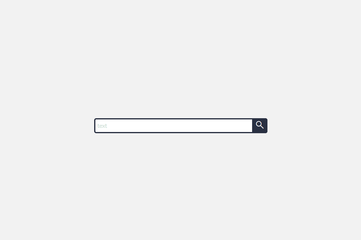
В сегодняшней статье мы вам покажем как создать простую форму поиска на своем сайте. Это окно поиска отличается от любой анимации простым возможным макетом. Этот пользовательский интерфейс окна поиска полезен для тех веб-сайтов, где не требуются сложные эффекты.
HTML Код.
html> html lang="en"> head> meta charset="UTF-8"> title>Simple Search Bar title> link rel="stylesheet" type="text/css" href="style.css"> link rel="stylesheet" href="https://fonts.googleapis.com/css2?family=Material+Symbols+Outlined:opsz,wght,FILL,GRAD@48,400,0,0"/> head> body> div class="wrap"> div class="search"> input type="text" class="searchTerm" placeholder="text"> button type="submit" class="searchButton"> span class="material-symbols-outlined"> search span> button> div> div> body> html>CSS Код.
@import url(https://fonts.googleapis.com/css?family=Open+Sans); body< background: #f2f2f2; font-family: 'Open Sans', sans-serif; > .search < width: 100%; position: relative; display: flex; > .searchTerm < width: 100%; border: 3px solid #293042; border-right: none; padding: 5px; height: 20px; border-radius: 5px 0 0 5px; outline: none; color: #9DBFAF; > .searchTerm:focus< color: #293042; > .searchButton < width: 40px; height: 36px; border: 1px solid #293042; background: #293042; text-align: center; color: #fff; border-radius: 0 5px 5px 0; cursor: pointer; font-size: 20px; > .wrap< width: 30%; position: absolute; top: 50%; left: 50%; transform: translate(-50%, -50%); >Всем спасибо, я надеюсь что вам моя статья хоть чем-то помогла.