CSS стилизация checkbox и radio — 2 варианта
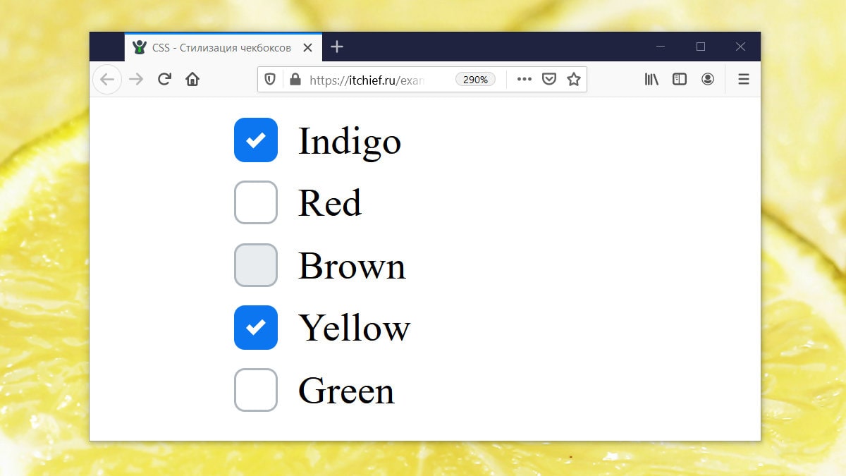
Как осуществляется создание кастомного чекбокса или переключателя
Данный процесс осуществляется посредством скрытия стандартного элемента и создания с помощью CSS другого «поддельного», такого как мы хотим .
Но как же это будет работать, если стандартный input скрыть? Это можно выполнить благодаря тому, что в HTML переключить состояние checked можно не только с помощью самого элемента input , но и посредством связанного с ним label .
В HTML связывание label с input выполняется одним из 2 способов:
1. Посредством помещения элемента input в label :
2. Посредством задания элементу input атрибута id , а label – for с таким же значением как у id .
В этой статье мы подробно разберём шаги по кастомизации checkbox и radio , в которых label с input свяжем по 2 варианту. Создание «поддельного» чекбокса выполним с использованием псевдоэлемента ::before , который поместим в label . При этом никакие дополнительные элементы в разметку добавлять не будем.
Создание стильного чекбокса
Процесс замены стандартного вида чекбокса на кастомный осуществим посредством выполнения следующей последовательности шагов.
Шаг 1. Создадим разметку.
При создании разметки очень важно соблюдать последовательность расположения элементов. Это необходимо, потому что в зависимости от того, как они расположены мы будем составлять выражения для выбора элементов в CSS и назначать им стили.
В этом примере элемент label расположен после input . Связь label с input осуществляется посредством соответствия значения for элемента label с id элемента input .
В примере к элементу input добавлен класс custom-checkbox . Данный класс мы будем использовать при составлении селекторов и тем самым с помощью него определять элементы к которым следует добавить стилизованный чекбокс вместо обычного. Т.е. его присутствие или отсутствие будет определять с каким чекбоксом (со стандартным или поддельным) будет выводится элемент input с type=»checkbox» .
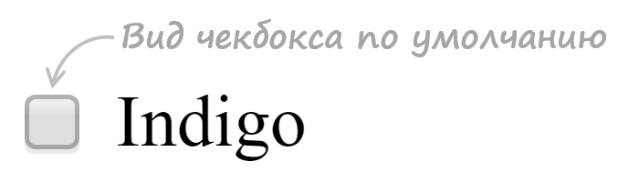
Шаг 2. Напишем стили для скрытия стандартного элемента input .
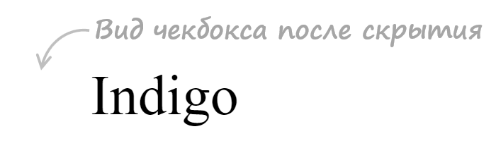
.custom-checkbox { position: absolute; z-index: -1; opacity: 0; }Мы не будем использовать display: none , а установим ему стили, с помощью которых уберём его из потока ( position: absolute ), поместим его ниже существующих элементов ( z-index: -1 ), а также сделаем его полностью прозрачным ( opacity: 0 ). Зачем это нужно? Это нам необходимо для того, чтобы мы могли получить состояние фокуса, а затем стилизовать «подделный» checkbox или radio , когда он будет находиться в нём.
Шаг 3. Создадим поддельный чекбокс.
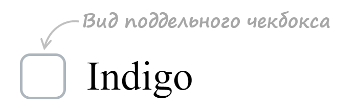
.custom-checkbox+label { display: inline-flex; align-items: center; user-select: none; } .custom-checkbox+label::before { content: ''; display: inline-block; width: 1em; height: 1em; flex-shrink: 0; flex-grow: 0; border: 1px solid #adb5bd; border-radius: 0.25em; margin-right: 0.5em; background-repeat: no-repeat; background-position: center center; background-size: 50% 50%; }Создание «поддельного» чекбокса выполним с помощью псевдоэлемента ::before . Посредством CSS зададим ему размеры (в данном случае 1em x 1em ), а затем нарисуем его с помощью border: 1px solid #adb5bd . Свойства начинающие со слова background будут определять положение самого флажка (когда checkbox будет в состоянии checked ).
Первое правило необходимо для вертикального центрирования флажка и надписи к нему. Это действие в примере выполнено через CSS Flexbox.
Шаг 4. Создадим стили при нахождении элемента в состоянии checked .
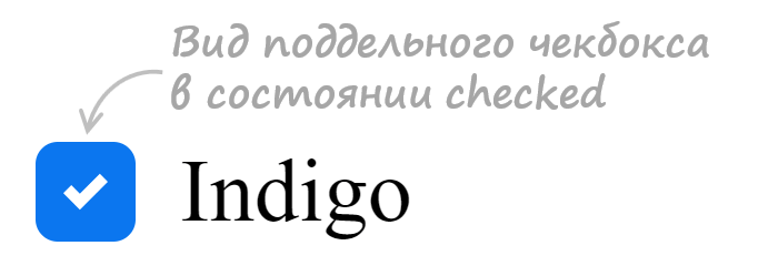
.custom-checkbox:checked+label::before { border-color: #0b76ef; background-color: #0b76ef; background-image: url("data:image/svg+xml,%3csvg xmlns='http://www.w3.org/2000/svg' viewBox='0 0 8 8'%3e%3cpath fill='%23fff' d='M6.564.75l-3.59 3.612-1.538-1.55L0 4.26 2.974 7.25 8 2.193z'/%3e%3c/svg%3e"); }В этом коде при получении элементом состояния checked применим к псевдоэлементу ::before находящемуся в label стили, посредством которых установим цвет границы, цвет фону и фоновую картинку (флажок) в формате svg.
Шаг 5. Добавим код для стилизации чекбокса при нахождении его в состояниях hover , active , focus и disabled .
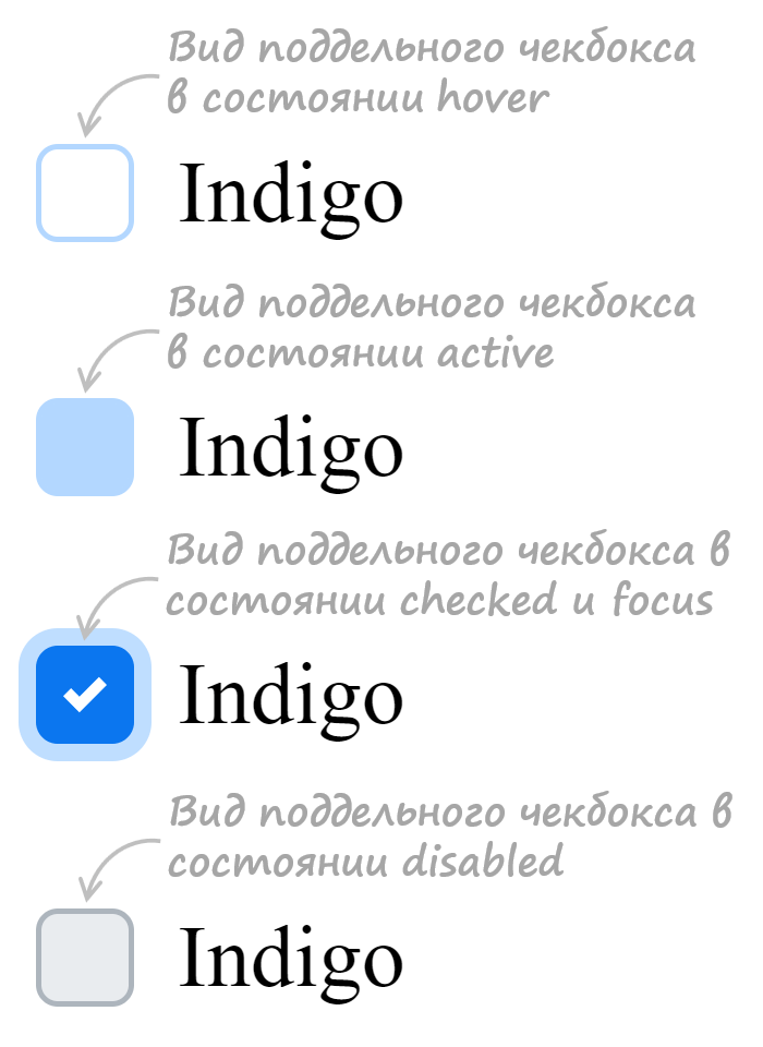
/* стили при наведении курсора на checkbox */ .custom-checkbox:not(:disabled):not(:checked)+label:hover::before { border-color: #b3d7ff; } /* стили для активного состояния чекбокса (при нажатии на него) */ .custom-checkbox:not(:disabled):active+label::before { background-color: #b3d7ff; border-color: #b3d7ff; } /* стили для чекбокса, находящегося в фокусе */ .custom-checkbox:focus+label::before { box-shadow: 0 0 0 0.2rem rgba(0, 123, 255, 0.25); } /* стили для чекбокса, находящегося в фокусе и не находящегося в состоянии checked */ .custom-checkbox:focus:not(:checked)+label::before { border-color: #80bdff; } /* стили для чекбокса, находящегося в состоянии disabled */ .custom-checkbox:disabled+label::before { background-color: #e9ecef; }Разработка кастомного переключателя
Стилизация переключателя ( input с type=»radio» ) выполняется аналогично, т.е. посредством тех же шагов которые мы применяли при кастомизации чекбокса.
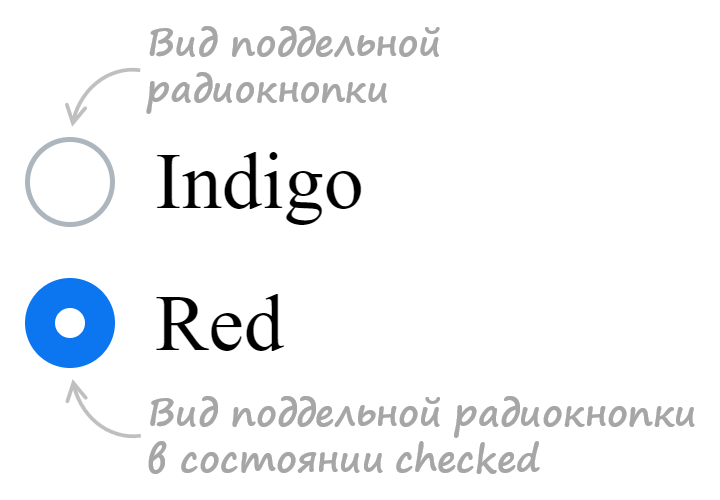
Итоговый набор стилей для кастомного оформления input с type=»radio» :
Ещё примеры по кастомизации checkbox и label
В этом разделе представлены следующие примеры:
- оформление чекбокса, когда input расположен в label
- оформление переключателя, когда input расположен в label
1. Стилизация checkbox, когда input расположен в label .
/* для элемента input c type="checkbox" */ .custom-checkbox>input { position: absolute; z-index: -1; opacity: 0; } /* для элемента label, связанного с .custom-checkbox */ .custom-checkbox>span { display: inline-flex; align-items: center; user-select: none; } /* создание в label псевдоэлемента before со следующими стилями */ .custom-checkbox>span::before { content: ''; display: inline-block; width: 1em; height: 1em; flex-shrink: 0; flex-grow: 0; border: 1px solid #adb5bd; border-radius: 0.25em; margin-right: 0.5em; background-repeat: no-repeat; background-position: center center; background-size: 50% 50%; } /* стили при наведении курсора на checkbox */ .custom-checkbox>input:not(:disabled):not(:checked)+span:hover::before { border-color: #b3d7ff; } /* стили для активного чекбокса (при нажатии на него) */ .custom-checkbox>input:not(:disabled):active+span::before { background-color: #b3d7ff; border-color: #b3d7ff; } /* стили для чекбокса, находящегося в фокусе */ .custom-checkbox>input:focus+span::before { box-shadow: 0 0 0 0.2rem rgba(0, 123, 255, 0.25); } /* стили для чекбокса, находящегося в фокусе и не находящегося в состоянии checked */ .custom-checkbox>input:focus:not(:checked)+span::before { border-color: #80bdff; } /* стили для чекбокса, находящегося в состоянии checked */ .custom-checkbox>input:checked+span::before { border-color: #0b76ef; background-color: #0b76ef; background-image: url("data:image/svg+xml,%3csvg xmlns='http://www.w3.org/2000/svg' viewBox='0 0 8 8'%3e%3cpath fill='%23fff' d='M6.564.75l-3.59 3.612-1.538-1.55L0 4.26 2.974 7.25 8 2.193z'/%3e%3c/svg%3e"); } /* стили для чекбокса, находящегося в состоянии disabled */ .custom-checkbox>input:disabled+span::before { background-color: #e9ecef; }2. Стилизация radio , когда input расположен в label .
/* для элемента input c type="radio" */ .custom-radio>input { position: absolute; z-index: -1; opacity: 0; } /* для элемента label связанного с .custom-radio */ .custom-radio>span { display: inline-flex; align-items: center; user-select: none; } /* создание в label псевдоэлемента before со следующими стилями */ .custom-radio>span::before { content: ''; display: inline-block; width: 1em; height: 1em; flex-shrink: 0; flex-grow: 0; border: 1px solid #adb5bd; border-radius: 50%; margin-right: 0.5em; background-repeat: no-repeat; background-position: center center; background-size: 50% 50%; } /* стили при наведении курсора на радио */ .custom-radio>input:not(:disabled):not(:checked)+span:hover::before { border-color: #b3d7ff; } /* стили для активной радиокнопки (при нажатии на неё) */ .custom-radio>input:not(:disabled):active+span::before { background-color: #b3d7ff; border-color: #b3d7ff; } /* стили для радиокнопки, находящейся в фокусе */ .custom-radio>input:focus+span::before { box-shadow: 0 0 0 0.2rem rgba(0, 123, 255, 0.25); } /* стили для радиокнопки, находящейся в фокусе и не находящейся в состоянии checked */ .custom-radio>input:focus:not(:checked)+span::before { border-color: #80bdff; } /* стили для радиокнопки, находящейся в состоянии checked */ .custom-radio>input:checked+span::before { border-color: #0b76ef; background-color: #0b76ef; background-image: url("data:image/svg+xml,%3csvg xmlns='http://www.w3.org/2000/svg' viewBox='-4 -4 8 8'%3e%3ccircle r='3' fill='%23fff'/%3e%3c/svg%3e"); } /* стили для радиокнопки, находящейся в состоянии disabled */ .custom-radio>input:disabled+span::before { background-color: #e9ecef; }:checked
Псевдокласс :checked применяется к скрытым чекбоксам в начале вашей страницы, которые могут использоваться, чтобы хранить некоторые динамические значения, используемые в CSS-правилах. Следующий пример показывает, как скрывать/показывать некоторые расширяемые элементы, нажимая на кнопку (открыть это демо).
doctype html> html> head> meta charset="utf-8" /> title>Расширяемые элементыtitle> style> #expand-btn margin: 0 3px; display: inline-block; font: 12px / 13px "Lucida Grande", sans-serif; text-shadow: rgba(255, 255, 255, 0.4) 0 1px; padding: 3px 6px; border: 1px solid rgba(0, 0, 0, 0.6); background-color: #969696; cursor: default; border-radius: 3px; box-shadow: rgba(255, 255, 255, 0.4) 0 1px, inset 0 20px 20px -10px white; > #isexpanded:checked ~ #expand-btn, #isexpanded:checked ~ * #expand-btn background: #b5b5b5; box-shadow: inset rgba(0, 0, 0, 0.4) 0 -5px 12px, inset rgba(0, 0, 0, 1) 0 1px 3px, rgba(255, 255, 255, 0.4) 0 1px; > #isexpanded, .expandable display: none; > #isexpanded:checked ~ * tr.expandable display: table-row; background: #cccccc; > #isexpanded:checked ~ p.expandable, #isexpanded:checked ~ * p.expandable display: block; background: #cccccc; > style> head> body> input type="checkbox" id="isexpanded" /> h1>Расширяемые элементыh1> table> thead> tr> th>Колонка #1th> th>Колонка #2th> th>Колонка #3th> tr> thead> tbody> tr class="expandable"> td>[текст ячейки]td> td>[текст ячейки]td> td>[текст ячейки]td> tr> tr> td>[текст ячейки]td> td>[текст ячейки]td> td>[текст ячейки]td> tr> tr> td>[текст ячейки]td> td>[текст ячейки]td> td>[текст ячейки]td> tr> tr class="expandable"> td>[текст ячейки]td> td>[текст ячейки]td> td>[текст ячейки]td> tr> tr class="expandable"> td>[текст ячейки]td> td>[текст ячейки]td> td>[текст ячейки]td> tr> tbody> table> p>[какой-то текст примера]p> p> label for="isexpanded" id="expand-btn">Показать скрытые элементыlabel> p> p class="expandable">[другой текст для примера]p> p>[какой-то текст примера]p> body> html>
Использование скрытых радиокнопок, чтобы хранить некоторые булевские значения в CSS
Также вы можете псевдокласс :checked , чтобы скрывать радиокнопки для того, чтобы создать, например, галерею изображений с полноразмерными картинками, показываемыми при наведении на них мыши. Загрузите это демо как вариант решения.
Примечание: Для аналогично эффекта, но основанного на псевдоклассе :hover (en-US) и без скрытых радиокнопок, смотрите это демо, взятое со страницы :hover (en-US) .
Спецификации
| Specification |
|---|
| HTML Standard # selector-checked |
| Selectors Level 4 # checked |
Поддержка браузерами
BCD tables only load in the browser
Found a content problem with this page?
- Edit the page on GitHub.
- Report the content issue.
- View the source on GitHub.
This page was last modified on 7 авг. 2023 г. by MDN contributors.
Your blueprint for a better internet.
How to style a checkbox using CSS
But the style is not applied. The checkbox still displays its default style. How do I give it the specified style?
30.7k 22 22 gold badges 106 106 silver badges 131 131 bronze badges
asked Nov 10, 2010 at 19:57
Salman Virk Salman Virk
12.1k 9 9 gold badges 37 37 silver badges 47 47 bronze badges
I wrote a tutorial about how to customize checkboxes and radios with CSS only, as well as create on/off switches. Check it out!
Jan 3, 2015 at 19:59
github.com/avatec/avatec-bootstrap3-custom-checkbox ready to use plugin
Feb 13, 2020 at 14:04
Whatever decision you make for styling checkboxes or radio buttons via CSS please make sure that they are accessible. As of this comment I believe only 2 of the 33 answers so far are accessible. For the rest of the answers you’re cutting off most, if not all accessibility. ( ctrl+f «accessibility»)
Jul 4, 2020 at 16:40
There’s a native CSS property for this now, skip to this answer.
Sep 13, 2021 at 14:46
Along with the accent-color CSS that (in most implementations) affects only the color when checked, it’s also possible to further customise the background color when unchecked by using CSS filters , see here (very useful for dark mode styles where the white of empty checkboxes don’t fit in).
Nov 1, 2022 at 16:09
43 Answers 43
The below answer references the state of things before widespread availability of CSS 3. In modern browsers (including Internet Explorer 9 and later) it is more straightforward to create checkbox replacements with your preferred styling, without using JavaScript.
Here are some useful links:
- Creating Custom Form Checkboxes with Just CSS
- Easy CSS Checkbox Generator
- Stuff You Can Do With The Checkbox Hack
- Implementing Custom Checkboxes and Radio Buttons with CSS3
- How to Style a Checkbox With CSS
It is worth noting that the fundamental issue has not changed. You still can’t apply styles (borders, etc.) directly to the checkbox element and have those styles affect the display of the HTML checkbox. What has changed, however, is that it’s now possible to hide the actual checkbox and replace it with a styled element of your own, using nothing but CSS. In particular, because CSS now has a widely supported :checked selector, you can make your replacement correctly reflect the checked status of the box.
Here’s a useful article about styling checkboxes. Basically, that writer found that it varies tremendously from browser to browser, and that many browsers always display the default checkbox no matter how you style it. So there really isn’t an easy way.
It’s not hard to imagine a workaround where you would use JavaScript to overlay an image on the checkbox and have clicks on that image cause the real checkbox to be checked. Users without JavaScript would see the default checkbox.
Edited to add: here’s a nice script that does this for you; it hides the real checkbox element, replaces it with a styled span, and redirects the click events.
community wiki
This answer is getting old! The primary link leads to a site comparing IE6 and IE7 styles.
Dec 14, 2012 at 13:15
Fair point — and the basic point isn’t really true anymore, in modern browsers. I’ve updated with some newer links, but left the original as a resource for older browsers.
Dec 14, 2012 at 19:04
Easy CSS Checkbox Generator, was really easy and n00b friendly. Comes with GUI for customized creation too! Well appreciated. 🙂
Sep 30, 2013 at 14:08
I’m interested in the old answer because I want this feature to be compatible with IE8+ & other browsers (chrome, firefox & safari). However I cannot find much feedback regarding the plugin you recommend ryanfait.com/resources/custom-checkboxes-and-radio-buttons
Jan 20, 2014 at 8:38
This is not a very useful answer — it’s just a list of articles, most of which are very old now.
Mar 1, 2018 at 6:17
You can achieve quite a cool custom checkbox effect by using the new abilities that come with the :after and :before pseudo classes. The advantage to this, is: You don’t need to add anything more to the DOM, just the standard checkbox.
Note this will only work for compatible browsers. I believe this is related to the fact that some browsers do not allow you to set :after and :before on input elements. Which unfortunately means for the moment only WebKit browsers are supported. Firefox + Internet Explorer will still allow the checkboxes to function, just unstyled, and this will hopefully change in the future (the code does not use vendor prefixes).
This is a WebKit browser solution only (Chrome, Safari, Mobile browsers)
$(function() < $('input').change(function() < $('div').html(Math.random()); >); >);/* Main Classes */ .myinput[type="checkbox"]:before < position: relative; display: block; width: 11px; height: 11px; border: 1px solid #808080; content: ""; background: #FFF; >.myinput[type="checkbox"]:after < position: relative; display: block; left: 2px; top: -11px; width: 7px; height: 7px; border-width: 1px; border-style: solid; border-color: #B3B3B3 #dcddde #dcddde #B3B3B3; content: ""; background-image: linear-gradient(135deg, #B1B6BE 0%, #FFF 100%); background-repeat: no-repeat; background-position: center; >.myinput[type="checkbox"]:checked:after < background-image: url('data:image/png;base64,iVBORw0KGgoAAAANSUhEUgAAAAcAAAAHCAQAAABuW59YAAAACXBIWXMAAAsTAAALEwEAmpwYAAAAIGNIUk0AAHolAACAgwAA+f8AAIDpAAB1MAAA6mAAADqYAAAXb5JfxUYAAAB2SURBVHjaAGkAlv8A3QDyAP0A/QD+Dam3W+kCAAD8APYAAgTVZaZCGwwA5wr0AvcA+Dh+7UX/x24AqK3Wg/8nt6w4/5q71wAAVP9g/7rTXf9n/+9N+AAAtpJa/zf/S//DhP8H/wAA4gzWj2P4lsf0JP0A/wADAHB0Ngka6UmKAAAAAElFTkSuQmCC'), linear-gradient(135deg, #B1B6BE 0%, #FFF 100%); >.myinput[type="checkbox"]:disabled:after < -webkit-filter: opacity(0.4); >.myinput[type="checkbox"]:not(:disabled):checked:hover:after < background-image: url('data:image/png;base64,iVBORw0KGgoAAAANSUhEUgAAAAcAAAAHCAQAAABuW59YAAAACXBIWXMAAAsTAAALEwEAmpwYAAAAIGNIUk0AAHolAACAgwAA+f8AAIDpAAB1MAAA6mAAADqYAAAXb5JfxUYAAAB2SURBVHjaAGkAlv8A3QDyAP0A/QD+Dam3W+kCAAD8APYAAgTVZaZCGwwA5wr0AvcA+Dh+7UX/x24AqK3Wg/8nt6w4/5q71wAAVP9g/7rTXf9n/+9N+AAAtpJa/zf/S//DhP8H/wAA4gzWj2P4lsf0JP0A/wADAHB0Ngka6UmKAAAAAElFTkSuQmCC'), linear-gradient(135deg, #8BB0C2 0%, #FFF 100%); >.myinput[type="checkbox"]:not(:disabled):hover:after < background-image: linear-gradient(135deg, #8BB0C2 0%, #FFF 100%); border-color: #85A9BB #92C2DA #92C2DA #85A9BB; >.myinput[type="checkbox"]:not(:disabled):hover:before < border-color: #3D7591; >/* Large checkboxes */ .myinput.large < height: 22px; width: 22px; >.myinput.large[type="checkbox"]:before < width: 20px; height: 20px; >.myinput.large[type="checkbox"]:after < top: -20px; width: 16px; height: 16px; >/* Custom checkbox */ .myinput.large.custom[type="checkbox"]:checked:after < background-image: url('data:image/png;base64,iVBORw0KGgoAAAANSUhEUgAAABAAAAAQCAYAAAAf8/9hAAAAGHRFWHRBdXRob3IAbWluZWNyYWZ0aW5mby5jb23fZidLAAAAk0lEQVQ4y2P4//8/AyUYwcAD+OzN/oMwshjRBoA0Gr8+DcbIhhBlAEyz+qZZ/7WPryHNAGTNMOxpJvo/w0/uP0kGgGwGaZbrKgfTGnLc/0nyAgiDbEY2BCRGdCDCnA2yGeYVog0Aae5MV4c7Gzk6CRqAbDM2w/EaQEgzXgPQnU2SAcTYjNMAYm3GaQCxNuM0gFwMAPUKd8XyBVDcAAAAAElFTkSuQmCC'), linear-gradient(135deg, #B1B6BE 0%, #FFF 100%); >.myinput.large.custom[type="checkbox"]:not(:disabled):checked:hover:after < background-image: url('data:image/png;base64,iVBORw0KGgoAAAANSUhEUgAAABAAAAAQCAYAAAAf8/9hAAAAGHRFWHRBdXRob3IAbWluZWNyYWZ0aW5mby5jb23fZidLAAAAk0lEQVQ4y2P4//8/AyUYwcAD+OzN/oMwshjRBoA0Gr8+DcbIhhBlAEyz+qZZ/7WPryHNAGTNMOxpJvo/w0/uP0kGgGwGaZbrKgfTGnLc/0nyAgiDbEY2BCRGdCDCnA2yGeYVog0Aae5MV4c7Gzk6CRqAbDM2w/EaQEgzXgPQnU2SAcTYjNMAYm3GaQCxNuM0gFwMAPUKd8XyBVDcAAAAAElFTkSuQmCC'), linear-gradient(135deg, #8BB0C2 0%, #FFF 100%); > Normal: Small: Large: Custom icon:
$(function() < var f = function() < $(this).next().text($(this).is(':checked') ? ':checked' : ':not(:checked)'); >; $('input').change(f).trigger('change'); >);body < font-family: arial; >.flipswitch < position: relative; background: white; width: 120px; height: 40px; -webkit-appearance: initial; border-radius: 3px; -webkit-tap-highlight-color: rgba(0, 0, 0, 0); outline: none; font-size: 14px; font-family: Trebuchet, Arial, sans-serif; font-weight: bold; cursor: pointer; border: 1px solid #ddd; >.flipswitch:after < position: absolute; top: 5%; display: block; line-height: 32px; width: 45%; height: 90%; background: #fff; box-sizing: border-box; text-align: center; transition: all 0.3s ease-in 0s; color: black; border: #888 1px solid; border-radius: 3px; >.flipswitch:after < left: 2%; content: "OFF"; >.flipswitch:checked:after
Webkit friendly mobile-style checkbox/flipswitch
30.7k 22 22 gold badges 106 106 silver badges 131 131 bronze badges
answered Jun 9, 2013 at 1:16
9,991 8 8 gold badges 55 55 silver badges 67 67 bronze badges
Firefox 33.1/Linux: The fiddle shows just default checkboxes. Nothing looks different.
Nov 27, 2014 at 7:33
@robsch This is clearly pointed out in the original post. Version of firefox or OS is irrelevant, it does not work in firefox. «FF + IE will still allow the check-boxes to function, just un-styled. «
Jan 4, 2015 at 22:25
A good approach. But not all browsers doing it good. Only Chrome has the best output as far as I examined.
Jun 9, 2015 at 12:56
Very nice. However. It is again an IE 5.x approach. Webkit only. Because it doesn’t always follow the rules. That’s the entire problem with webkit browsers.
Mar 23, 2016 at 11:17
i believe this is invalid and webkit/blink are violating the spec. ::before and ::after only work on containers; checkboxes are replaced elements. same reason you can’t use them on images.
Dec 8, 2019 at 3:21
Before you begin (as of Jan 2015)
The original question and answer are now ~5 years old. As such, this is a little bit of an update.
Firstly, there are a number of approaches when it comes to styling checkboxes. The basic tenet is:
- You will need to hide the default checkbox control which is styled by your browser, and cannot be overridden in any meaningful way using CSS.
- With the control hidden, you will still need to be able to detect and toggle its checked state.
- The checked state of the checkbox will need to be reflected by styling a new element.
The solution (in principle)
The above can be accomplished by a number of means — and you will often hear that using CSS3 pseudo-elements is the right way. Actually, there is no real right or wrong way, it depends on the approach most suitable for the context you will be using it in. That said, I have a preferred one.
- Wrap your checkbox in a label element. This will mean that even when it is hidden, you can still toggle its checked state by clicking anywhere within the label.
- Hide your checkbox.
- Add a new element after the checkbox which you will style accordingly. It must appear after the checkbox so it can be selected using CSS and styled dependent on the :checked state. CSS cannot select ‘backwards’.
The solution (in code)
label input < visibility: hidden;/* label span Refinement (using icons)
"But hey!" I hear you shout. What about if I want to show a nice little tick or cross in the box? And I don't want to use background images!
Well, this is where CSS3's pseudo-elements can come into play. These support the content property which allows you to inject Unicode icons representing either state. Alternatively, you could use a third party font icon source such as font awesome (though make sure you also set the relevant font-family , e.g. to FontAwesome )
label input < display: none; /* Hide the default checkbox */ >/* Style the artificial checkbox */ label span < height: 10px; width: 10px; border: 1px solid grey; display: inline-block; position: relative; >/* Style its checked state. with a ticked icon */ [type=checkbox]:checked + span:before
2,562 3 3 gold badges 31 31 silver badges 57 57 bronze badges
answered Jan 5, 2015 at 11:59
70.1k 20 20 gold badges 133 133 silver badges 137 137 bronze badges
Except for: simplified HTML, simplified CSS, detailed explanation.
Jan 30, 2015 at 8:47
@AnthonyHayward - updated answer, this was due to using display:none which does not instantiate the control in a tabbable way, I've changed
Oct 8, 2015 at 21:02
I was struggling to find an example in which the checkbox was inside of the label rather than before/after it. This is a very well documented and explained solution. It would be great to see this answer updated for January 2016.
Jan 16, 2016 at 7:19
Still not tabbable with display: none .
Mar 4, 2016 at 17:29
Replace visibility: hidden; with opacity: 0 !important; if you're still having trouble with tabbing.
Feb 8, 2017 at 7:32
There is a way to do this using just CSS. We can (ab)use the label element and style that element instead. The caveat is that this will not work for Internet Explorer 8 and lower versions.
.myCheckbox input < position: relative; z-index: -9999; >.myCheckbox span < width: 20px; height: 20px; display: block; background: url("link_to_image"); >.myCheckbox input:checked + span
30.7k 22 22 gold badges 106 106 silver badges 131 131 bronze badges
answered Aug 30, 2012 at 8:59
Blake Pettersson Blake Pettersson
8,947 3 3 gold badges 27 27 silver badges 36 36 bronze badges
@GandalfStormCrow this will work for any browser that supports the :checked pseudo-class, which IE8 does NOT support. You can check if this works with selectivizr.com - which adds support for :checked and friends.
Oct 5, 2012 at 12:08
In other words, IE9 and later versions supports :checked.
Oct 8, 2012 at 13:13
There is a polyfill for IE8 and below: github.com/rdebeasi/checked-polyfill
Jan 2, 2014 at 19:49
It's working, but first time it flickers. Why is it happening?
Mar 4, 2016 at 2:26
I believe hidden input s never take keyboard focus, so these are unreachable by keyboard.
Mar 4, 2016 at 17:27
Modern accessible solution - use accent-color
Use the new accent-color property and make certain to meet a proper contrast ratio of 3:1 to ensure accessibility. This also works for radio buttons.
.red-input < accent-color: #9d3039; height: 20px; /* not needed */ width: 20px; /* not needed */ >Old answer, I only recommend this if you need more customization than the above offers:
I have been scrolling and scrolling and tons of these answers simply throw accessibility out the door and violate WCAG in more than one way. I threw in radio buttons since most of the time when you're using custom checkboxes you want custom radio buttons too.
Fiddles:
- Checkboxes - pure CSS - free from 3rd party libraries
- Radio buttons - pure CSS - free from 3rd party libraries
- Checkboxes* that use FontAwesome but could be swapped with Glyphicons, etc. easily
Late to the party but somehow this is still difficult in 2019, 2020, 2021 so I have added my three solutions which are accessible and easy to drop in.
These are all JavaScript free, accessible, and external library free*.
If you want to plug-n-play with any of these just copy the style sheet from the fiddles, edit the color codes in the CSS to fit your needs, and be on your way. You can add a custom svg checkmark icon if you want for the checkboxes. I've added lots of comments for those non-CSS'y folks.
If you have long text or a small container and are encountering text wrapping underneath the checkbox or radio button input then just convert to divs like this.
Longer explanation: I needed a solution that does not violate WCAG, doesn't rely on JavaScript or external libraries, and that does not break keyboard navigation like tabbing or spacebar to select, that allows focus events, a solution that allows for disabled checkboxes that are both checked and unchecked, and finally a solution where I can customize the look of the checkbox however I want with different background-color 's, border-radius , svg backgrounds, etc.
I used some combination of this answer from @Jan Turoň to come up with my own solution which seems to work quite well. I've done a radio button fiddle that uses a lot of the same code from the checkboxes in order to make this work with radio buttons too.
I am still learning accessibility so if I missed something please drop a comment and I will try to correct it.
Here is a code example of my checkboxes:
input[type="checkbox"] < position: absolute; opacity: 0; z-index: -1; >/* Text color for the label */ input[type="checkbox"]+span < cursor: pointer; font: 16px sans-serif; color: black; >/* Checkbox un-checked style */ input[type="checkbox"]+span:before < content: ''; border: 1px solid grey; border-radius: 3px; display: inline-block; width: 16px; height: 16px; margin-right: 0.5em; margin-top: 0.5em; vertical-align: -2px; >/* Checked checkbox style (in this case the background is green #e7ffba, change this to change the color) */ input[type="checkbox"]:checked+span:before < /* NOTE: Replace the url with a path to an SVG of a checkmark to get a checkmark icon */ background-image: url('https://cdnjs.cloudflare.com/ajax/libs/ionicons/4.5.6/collection/build/ionicons/svg/ios-checkmark.svg'); background-repeat: no-repeat; background-position: center; /* The size of the checkmark icon, you may/may not need this */ background-size: 25px; border-radius: 2px; background-color: #e7ffba; color: white; >/* Adding a dotted border around the active tabbed-into checkbox */ input[type="checkbox"]:focus+span:before, input[type="checkbox"]:not(:disabled)+span:hover:before < /* Visible in the full-color space */ box-shadow: 0px 0px 0px 2px rgba(0, 150, 255, 1); /* Visible in Windows high-contrast themes box-shadow will be hidden in these modes and transparency will not be hidden in high-contrast thus box-shadow will not show but the outline will providing accessibility */ outline-color: transparent; /*switch to transparent*/ outline-width: 2px; outline-style: dotted; >/* Disabled checkbox styles */ input[type="checkbox"]:disabled+span < cursor: default; color: black; opacity: 0.5; >/* Styles specific to this fiddle that you do not need */ body < padding: 1em; >h1
NOTE: Replace the url for the background-image in CSS with a path to an SVG in your solution or CDN. This one was found from a quick google search for a checkmark icon cdn
You can easily change the background color, checkbox symbol, border-radius, etc.
Цвет птички чекбокса и лейбла
@BlackFire, то что вы видели, называется кастомный чекбокс и его можно реализовать одними средствами css, но можно и плагины применить. Внизу отличный пример кастомного чекбокса.
5 авг 2017 в 4:49
1 ответ 1
Сортировка: Сброс на вариант по умолчанию
Checkbox нельзя модифицировать, т.к он задается ОС. В таких случаях скрывают стандартный input и отображают кастомный со своими стилями. Ниже пример как это делается:
label input < display: none;/* label span Отслеживать
ответ дан 4 авг 2017 в 17:44
1,901 8 8 серебряных знаков 13 13 бронзовых знаков
Может, оттранслируете в css и добавите код в ответ?
4 авг 2017 в 20:02
@br3t мне так лень, что я нашел другой ответ проще на SO и немного локализовал)
4 авг 2017 в 20:21
Можно ли менять цвет кастомного Checkbox/ Например при отправке формы, сделать его неактивным визуально (сменив на серый цвет) к примеру?
3 сен 2018 в 19:24
- html
- css
-
Важное на Мете
Связанные
Похожие
Подписаться на ленту
Лента вопроса
Для подписки на ленту скопируйте и вставьте эту ссылку в вашу программу для чтения RSS.
Дизайн сайта / логотип © 2023 Stack Exchange Inc; пользовательские материалы лицензированы в соответствии с CC BY-SA . rev 2023.11.15.1019
Нажимая «Принять все файлы cookie» вы соглашаетесь, что Stack Exchange может хранить файлы cookie на вашем устройстве и раскрывать информацию в соответствии с нашей Политикой в отношении файлов cookie.